7 Reasons Responsive Design is What You Should be Asking For!
7 Reasons Responsive Design is What You Should be Asking For!
In 2015, Google updated their search ranking algorithm to factor in a website’s ‘mobile-friendliness’ as a ranking signal. That means that as of April 26, 2015 sites not optimized for smartphones smaller screens started seeing their ranking downgraded.
If your site is like most websites, Google brings you more traffic than any other source. Google estimates that more than half of all searches are performed on mobile devices. If you aren’t seeing similar results in your traffic, it’s most likely because your website isn’t mobile-friendly. While Google doesn't explicitly favor one method of mobile optimization over another in the rankings, the search engine does recommend using responsive design. Doing what Google recommends seems like a no-brainer.
If you are unclear whether your website is considered mobile-friendly by Google, use their free online test.
If your site isn’t mobile-friendly, you have several options to get you there. These options will be most likely be tied to the web developer you choose, but generally speaking the options include: building a separate mobile website, adaptive design, responsive design or even a mobile app. For most websites, the best solution is responsive design. Here are 7 reasons why:
- Google recommends it
If your website is like most websites, the vast majority of traffic is coming from Googles search results. Given that more than half of online searches today are coming from mobile devices, shouldn’t your website be in line with what the world’s most utilized search engine recommends? Google recommends using responsive design. That should be good enough for you. - Better Cross-Device Experience
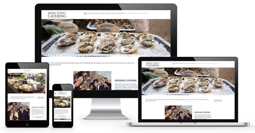
Mobile Shopping Research, published by Internet Retailer, found that the majority of shoppers will use multiple devices when shopping. When it comes to conversion rates, it’s clear that usability and trust are key components. What the research found is that customers might begin their research on a mobile device and then return to your site later from a tablet or desktop to purchase or complete a contact form. What if your desktop site doesn’t match the look and feel of your mobile site? With responsive design, your customers will always get a uniform experience across all devices. This reinforces usability and trust and increases conversion which translates into SALES! - Responsive Design is Exact
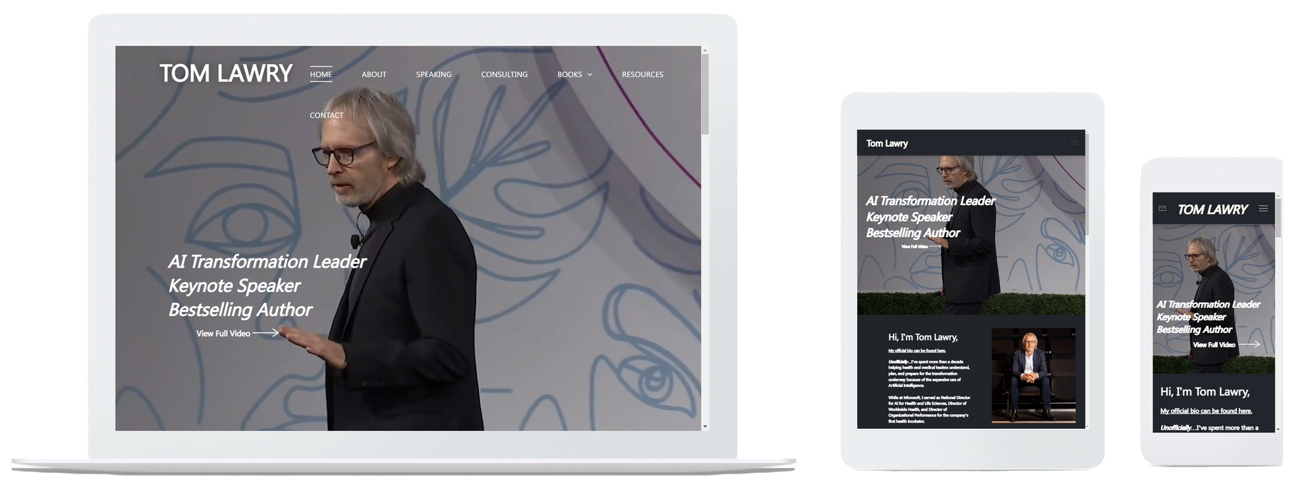
Responsive Design provides an ideal user experience on any device. No mater what device your customer uses, smart phone, tablet, laptop or desktop, they will see the site you want them to see. Other methods of mobile optimization can only optimize for a specific device (not multiple devices). - One Website to design, build and maintain
It is true that Responsive Design is more complex than a traditional desktop website, but with other options, you’ll need to build a stand-alone mobile website. That means with other options, you'll need to invest additional time and expense to design, build and maintain two websites. - Superior SEO
If you want your website to rank well in both desktop and mobile search, you’ll only need to optimize one domain and one version of each page. When you opt for a separate mobile website, you are doubling the workload. In addition, with a Responsive Design, you will eliminate the potential of duplicate content which decreases your ranking. - Scalability
Display technology continues to change on a rapid pace. Mobile phone and tablet screen sizes are always changing. While other methods of design focus on specific screen sizes, Responsive Design does not! Your website will render properly on today’s version of a smartphone, as it will on what comes next. - Cost
You will hear lots about Responsive Design costing much more than the other methods. You will be surprised when you contact us for a quote. We have been quoting $900 for a basic 5-page website. Hosting plan for a Responsive Design Website costs $39/month. This includes a User Control Panel allowing you to make edits yourself if you choose. This price includes SEO at launch and monthly summary or detailed traffic reports sent directly to your email inbox.
If your website is 3 years or older, you are a likely candidate for a website redesign. The days of talking about most online searches being performed via a mobile device have come! If your website is not mobile-friendly, you are missing out on all those potential customers and clients searching for your products and services from their mobile device. Contact ustoday for your FREE, no obligation, consultation.